Thank you for unleashing your creative side, gentlemen—but maybe, we have seen enough.
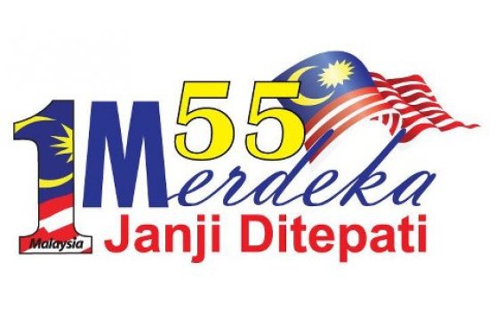
 It is a joke, isn’t it? Oh, wait. No, it’s not. The supposedly official logo for the 55th National Day celebrations came out as crude – awfully crude. The damage, it seems, has been done without consultation. Viewers everywhere have suggested, scornfully, that the logo is ‘made using Microsoft Word in less than 5 minutes’. In an interesting, albeit mostly online uproar, Malaysians greeted the gaudy taste in logo design with direct shock and discontent.
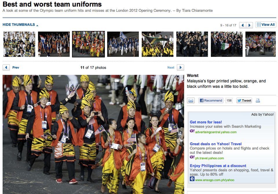
Their surprise is given a jolt by the parade of Malaysia’s garish taste in fashion, as our national team was ushered into the glittering opening ceremony of the London 2012 Olympics. Our soaring pride and high spirits were tainted by the world’s agonizing perception towards our tackily designed national team costume – ranked by one online portal as the worst team costume. Now understandably puzzled, Malaysians —already laced with contempt and grief— responded with a concerned question: just, why?
In the increasingly sharp eyes of the rakyat, the government is clumsily coveting to be the nation’s proprietor of ugliness. This is definitely unfair for Malaysians everywhere—their diverse selves already a beauty—whose ancestors inherited majestic and rich cultural traits laced with values of aesthetics too immense to be mishandled.
This mishandling, sadly, continues. Taking off from the visual examples to an audible version of faux pas, eyebrows were raised at the lyrics of the National Day song titled in lieu of the controversially opted theme, ‘Janji Ditepati’. The composition of an official song meant for the listening of the entire nation is now defiled—while being critically unripe—with words cheesy, handpicked to spread the political message of the ruling party, unashamedly hijacking the substantial message of Merdeka in favour of partisan interests.
<iframe width=”560″ height=”315″ src=”http://www.youtube.com/embed/DG–QGXqnlM” frameborder=”0″ allowfullscreen></iframe>
Looking deeper into these show of blunders, we ponder at the rising fact that the government is constantly lacking in capacity to realise the need to balance the ever-rich, ever-celebratory Malaysian context with their design products. From what we can perceive and analyse, following these recent blunders – it is as if, in the drawing boards of government-led proposals, design concerns are often seen as an isolated point, marginalized and dismissed as an ‘easy matter’.
It seems that the oft-murky surroundings that engulf the government’s version of design advocacy—to put themselves in the role of the player for design approach—signals a worrying out-of-touch relationship with an increasingly-discerning client: the rakyat. An obvious and growingly large proportion of well educated, design-conscious Malaysian population simply can’t dismiss these silly blunders anymore, insisting answers instead, to the point of demanding the scrutiny of the processes that lead to the products, and importantly, pushing further for better designs.
Whether it’s a logo, a song, a poem, a building, or furniture – good design will always carry a fair amount of meaning, and probably outlive its maker. The ability of these designs to transcend the mortal boundaries of time and space enables them to tell stories and represent lifestyles. Having that said, design is a medium to communicate. The answer to what’s the fuss, is largely because of this. What exactly are these designs communicating, and what meanings are they offering – not only for now, but also for the future?
 Upon seeing these blunders, we might ask, what kind of Malaysia do we want to portray through a logo for its 55th Merdeka anniversary? What kind of nation are we showcasing globally through the national Olympic team costume? What kind of direction are we promoting through the composition of a nationally celebrated song?
Pray tell, are these designs representing a flimsy nation with brittle citizens, misguided only by their leaders, or are the designs suggest Malaysians standing proud, progressive and pragmatic, firm in their stands and sure in their pace?
Worryingly, the meanings of the designs are shaky. Glimpses of blind pride and solipsism seemed to have laid down the foundation for these designs, blending perhaps with authoritative approaches, producing the awkward results. A maturing, progressive Malaysia simply can’t be represented by designs executed based on these attitudes.
The loud public participation has proven to be instrumental, with the Merdeka logo now being put off. However, this is only one of the many baby steps Malaysians need to take in deciding what’s better for their growth – in design, and at large, in their lives. —The Rocket


